
Mitch Millsaps
Software designer based in Denver, CO.
Side projects

My final post for Calendly. I'll be going somewhere new soon but figured I'd share a preview of the shared library I made to keep us on track across teams.


Just a small snippet of an upcoming Clearbit integration into scheduled events. Neat and spooky at the same time since it gives valuable info before a meeting but also feels like big brother.

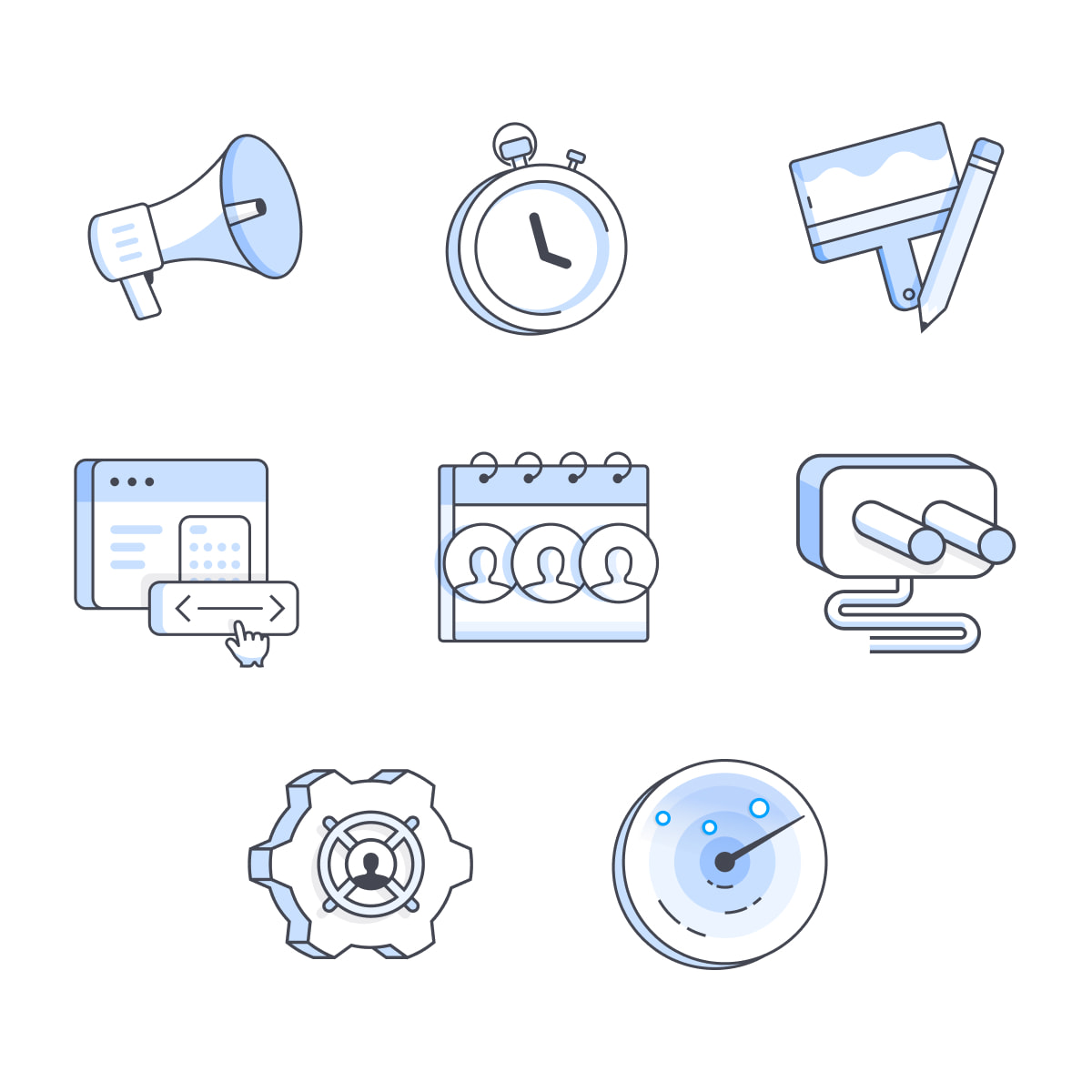
Some stickers I illustrated for Calendly's meeting rooms. All 4 are named after cocktails: Mojito, Moscow Mule, Mai Tai, Manhattan

The redesigned help center for Calendly is out now. I continued the illustration style for onboarding so people can easily recognize metaphors they've seen already and new ones for the more cryptic concepts.
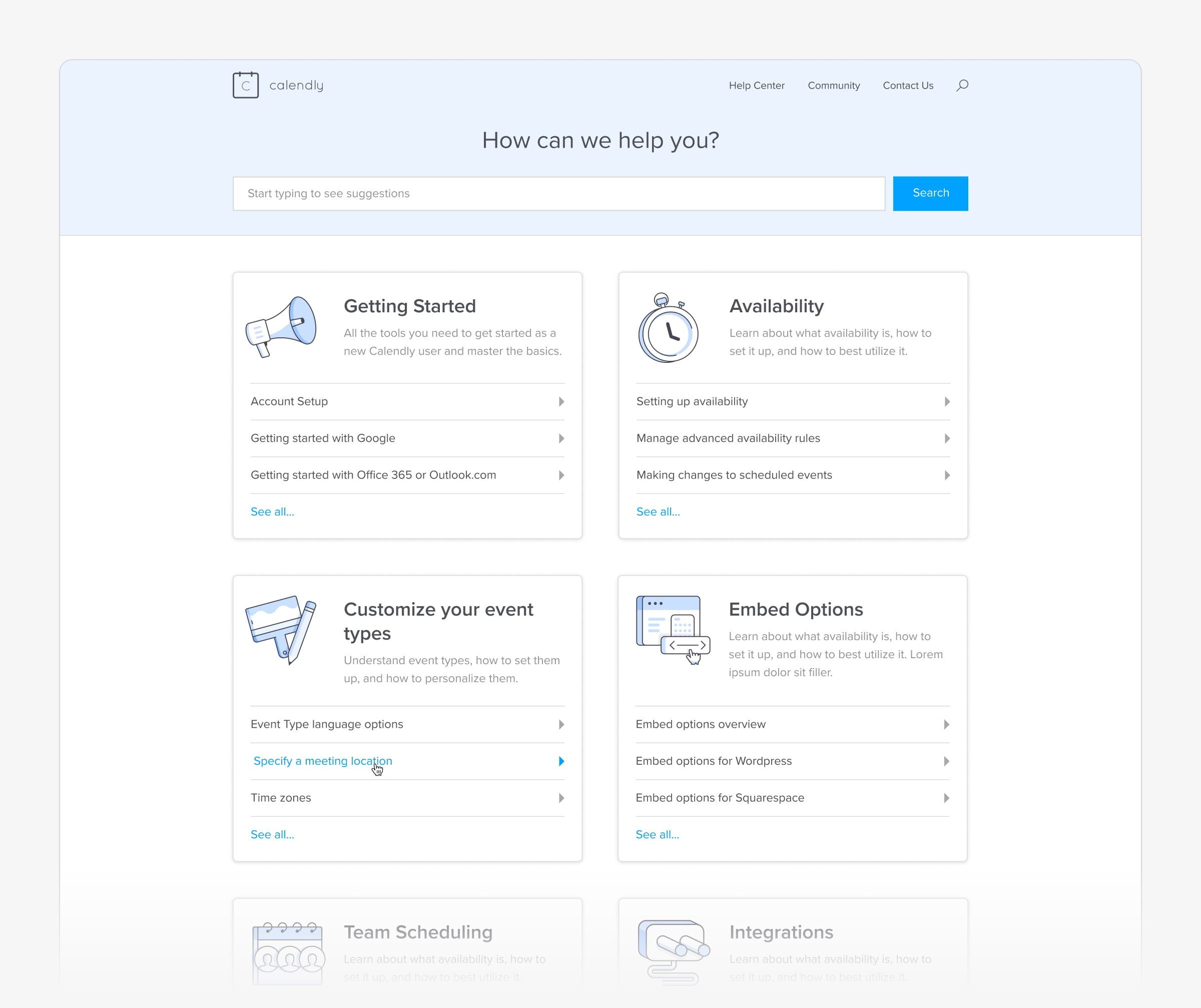

I coordinated a lot with the Support team to show the most important info upfront without making it intimidating to find what customers are looking for.
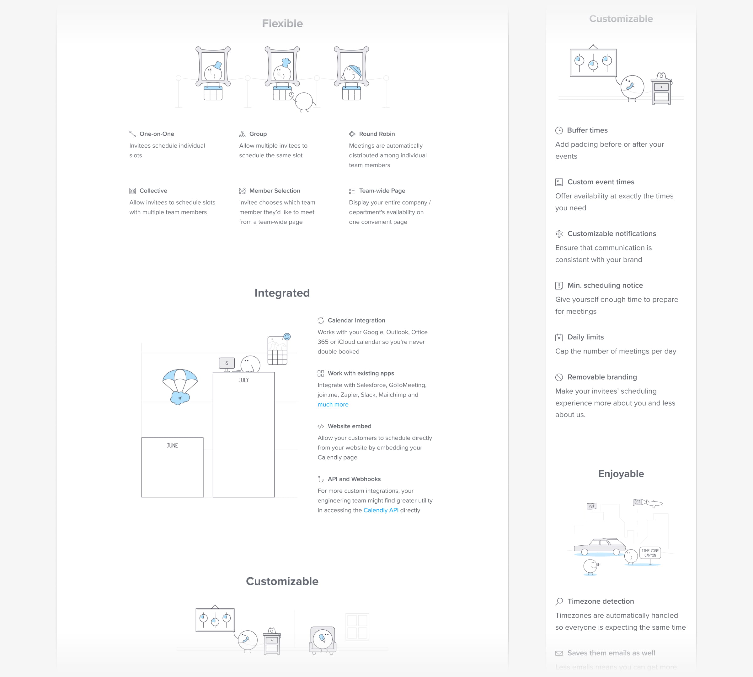
I'm excited to say the new Event Types page is live 🎉! This was probably our biggest effort to date and the first one where we integrated research and testing top-to-bottom. It took years of myself and others campaigning but we managed to pull it off and the company is stronger for it.
.jpg)


This turned out to be a beautifully textbook design cycle. Many times it's rare to go through all the proper stages from needfinding to user testing before and after release but we managed it here and the result was incredible.
Over the course of this I was able to define our userbase into 3 major archetypes (with some subtypes) that have already started transforming how we discuss efforts. Speaking with the same users again after release was such a validating experience when they expressed how much it was improving their workflows already.
Editors note: The core of this design is still in use as of Sep 2025. That's a huge impact and fills me with pride for the work I did.
Had the chance to design the new onboarding experience for Calendly. It's been live for a while now and we've seen a huge uptick in first time meetings scheduled — one of our primary success metrics.
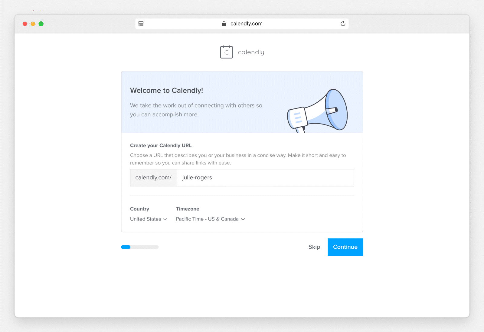
This was an awesome validation of the original hypothesis — the existing onboarding being barebones and disconnected. We've been speaking with customers a lot more lately and the research insights we've gained made this the best it could be.
Couple of illustrations for Calendly's newsletter emails. Really like the metaphor for time management.


Updated the Calendly pricing page now that we have a new plan and tons of new features.

Just a snippet of the updated features page as the 'Mitch bots' (as the rest of the team has taken to calling them) take over our marketing.
It's finally live! One of my first big projects at Calendly was redesigning the home page to make it friendly and easier to understand. I had a lot of freedom in creating the illustration style — daunting but fun.

Creating a company's illustration style was eye-opening. Maintaining consistency and even the sheer amount of work was new to me as I'm not a traditional illustrator. I leaned a lot on metaphor for the subjects but I'm happy with how it came out.
