Mitch Millsaps
Software designer based in Denver, CO.
Side projects

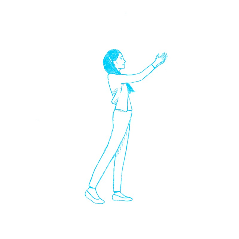
An unused concept for the Stimulus home page but it was fun to play around with the style


Got to design a fun landing page for an event we're throwing

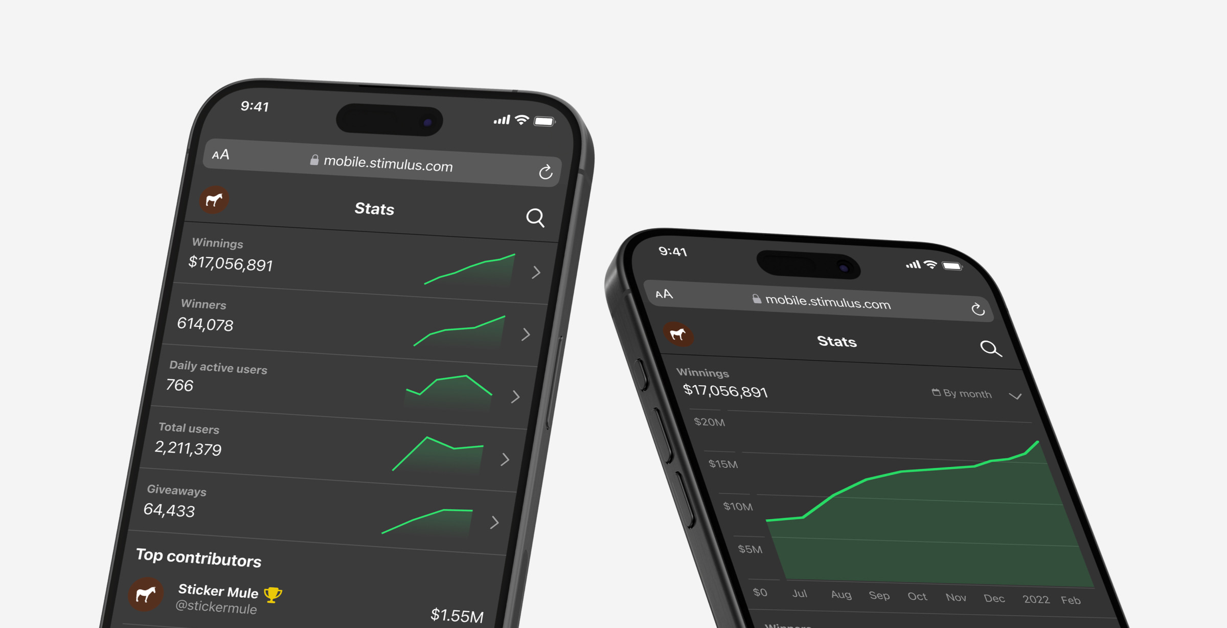
Quick preview of our random side social media project's public stats page.

With 2 new people on the team our files were getting pretty messy to navigate without context. I took some time to lay out a structure for both the files and the projects they're in so designers, devs, and stakeholders can easily find everything they need.
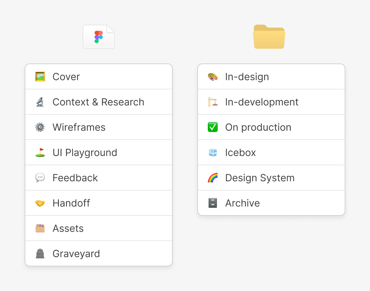
I went into this wanting to avoid constant thumbnail management and make everything clear at a glance. I spoke with contributors of each discipline to check the hypothesis and it confirmed my thoughts.
Editor's note: This has been live for a few years now and it's still working like a charm. The file structure has fared better than the project structure which is becoming more reliant on search given our breadth of tasks.
Some fun illustrations for various states around the Stimulus site for giveaways, shopping, and account management.

Some icons from a series I'm making for random spots around Sticker Mule

Tried my hand at recreating a cool photo of a monopoly board in photorealistic style. Reflections are hard.

Fun idea I had for an app where you log the games you play and get the communal review aspect. Making the icons for this was fun and I thought the PS2 memory card for logging a new game was pretty clever.

Since I started we've been building out a suite of free creative tools that are simple and intuitive. Today we launched a hub page for new and existing customers to discover them and start leveling up their workflows.

My final post for Calendly. I'll be going somewhere new soon but figured I'd share a preview of the shared library I made to keep us on track across teams.

Just a small snippet of an upcoming Clearbit integration into scheduled events. Neat and spooky at the same time since it gives valuable info before a meeting but also feels like big brother.

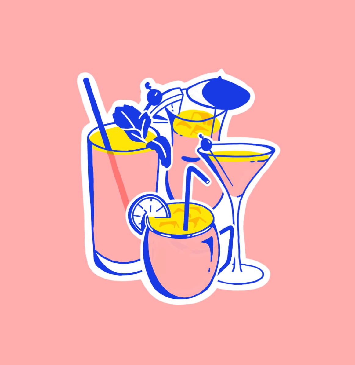
Some stickers I illustrated for Calendly's meeting rooms. All 4 are named after cocktails: Mojito, Moscow Mule, Mai Tai, Manhattan
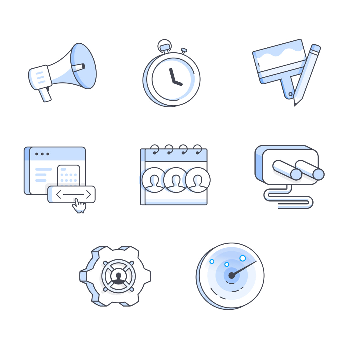
The redesigned help center for Calendly is out now. I continued the illustration style for onboarding so people can easily recognize metaphors they've seen already and new ones for the more cryptic concepts.
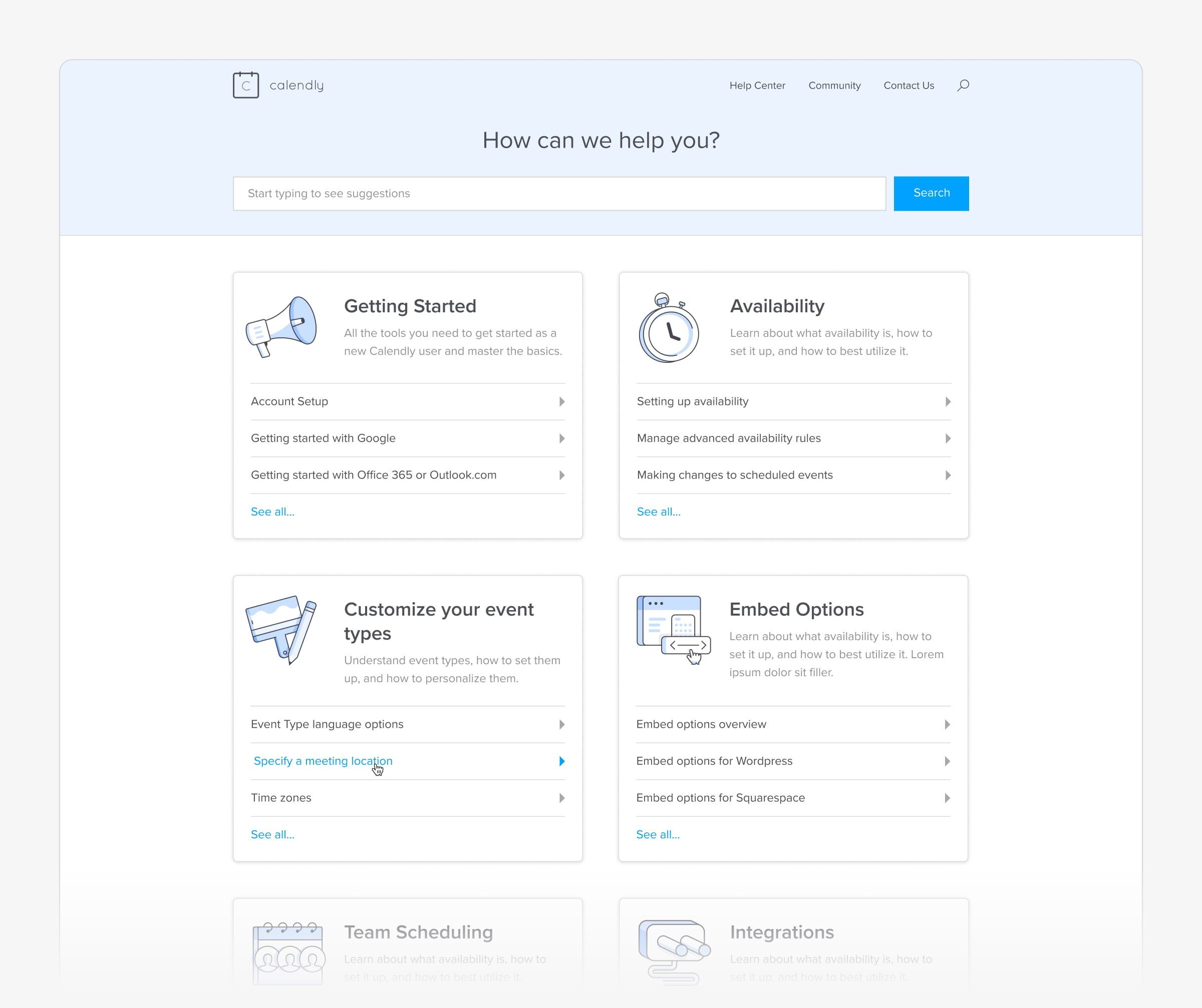

I coordinated a lot with the Support team to show the most important info upfront without making it intimidating to find what customers are looking for.